DWD Responsive Design
Pre-responsive Design
Unfortunately, the latest designs implemented in the dwd-frontend-react project
have not all been responsive. Specifically, Some of the maps pages with user inputs
along the top of the screen don't play well with smaller screens. The inputs
stay on one line even when it collapses down.
We can try to rework it to use fluid grids like normal, but I'm concerned that then the vertical content will be too much and the map too small to effectively use.
I think a better approach would be to collapse the user inputs into an icon that expands into a larger menu when clicked. I don't yet know if this would work best as a modal or drawer.
The rest of this section will document some specific examples at different screen sizes.
Existing Design Screenshots
Home Page
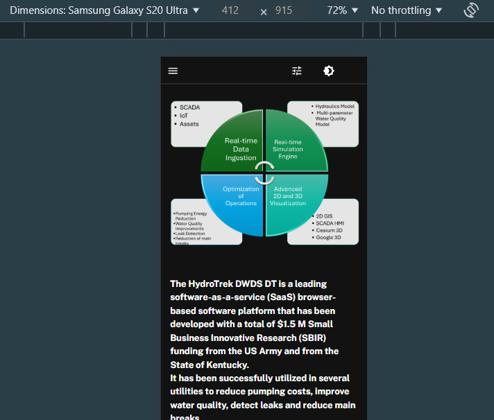
The home page looks fine:
3D Map
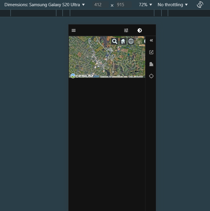
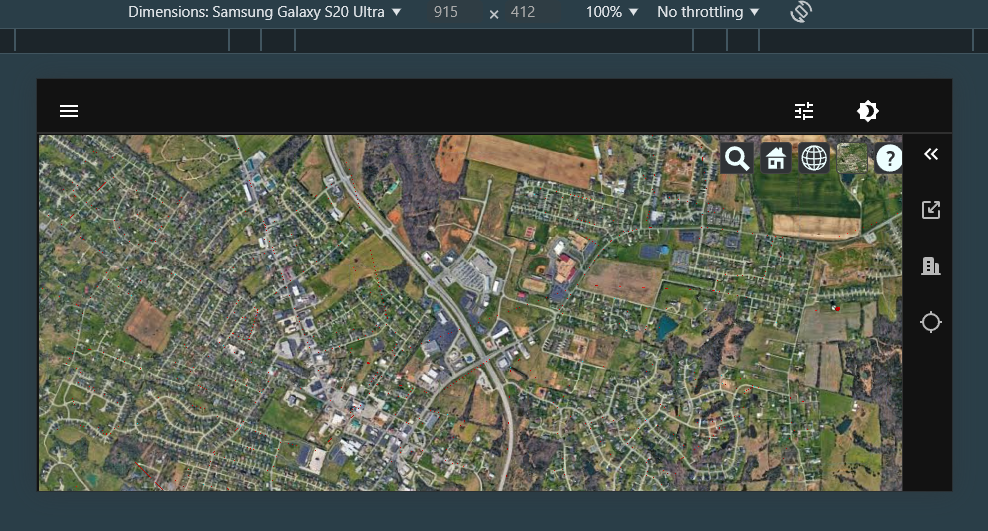
The 3D map looks fine in landscape mode, but the default vertical/portrait mode is unusable. To resolve this, I propose we 1. make the map height 100% on small screens
2D Network Map
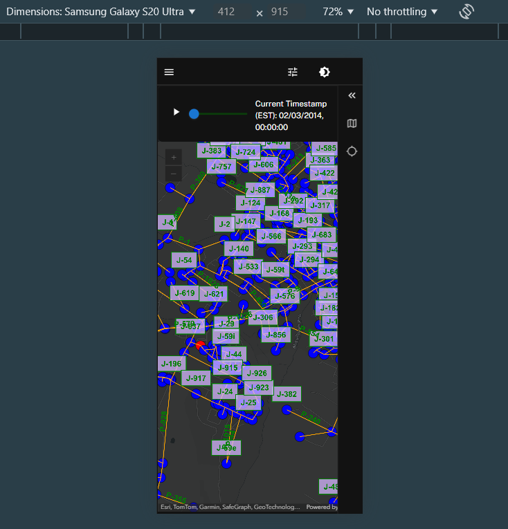
The 2D network map looks fine. However, if we end up moving the time slider on other pages, we should keep the designs consistent and move it on this page as well.
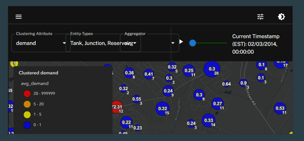
2D Cluster Map
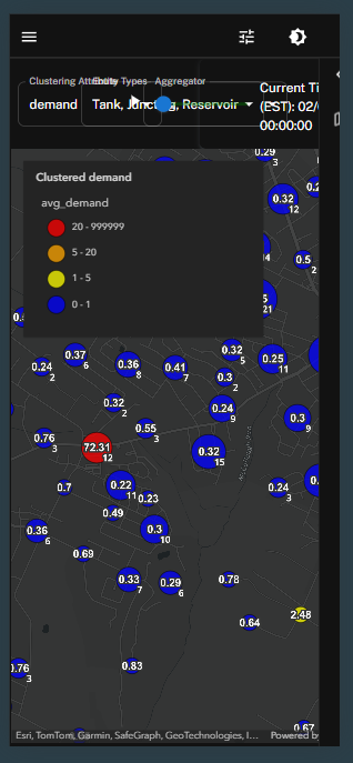
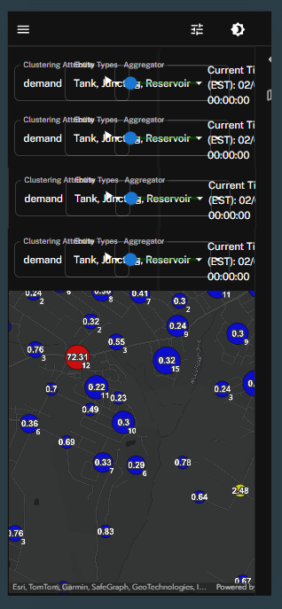
The 2D cluster map looks bad on any small screen, both in portrait and landscape. Resolving this page will be complicated. We can't just adopt a standard fluid grid design. If we do, then the user input content will take up too much vertical space (at least half the page in portrait and even more in landscape).
My initial thoughts for this page are to move the user inputs into a popup modal or drawer similar to how we handle user input in SWC. This is also more consistent with ESRI design philosophies. Keep a minimal interface with small icons to open larger/more complex interfaces.
Specifically, I'd propose we 2. move the user inputs into a modal that is triggered by an icon in the right side AppBar/ActionBar.
Heatmap
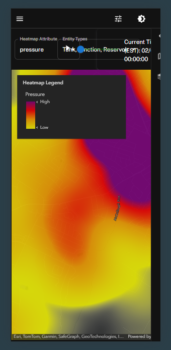
The heatmap has the same exact issues as the clutser map. My proposal is the same.
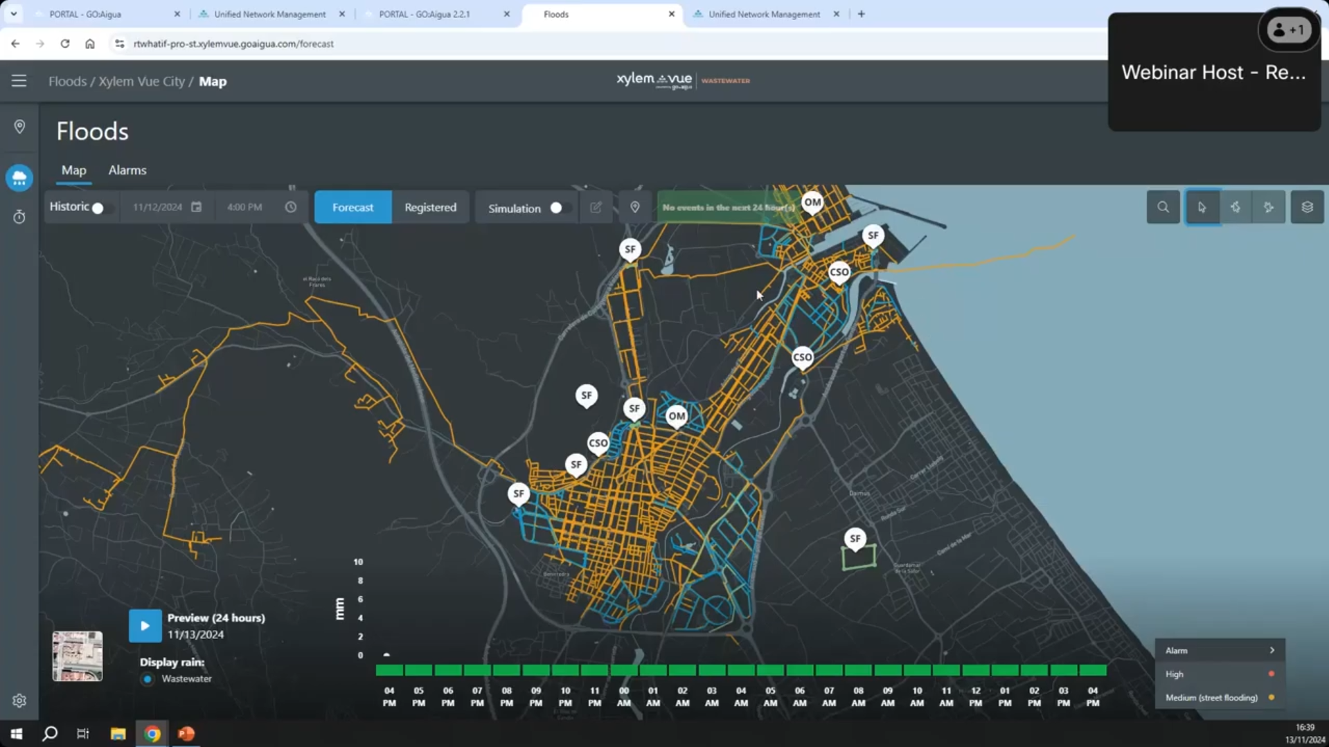
Other Products with Similar Designs
Xylem Vue
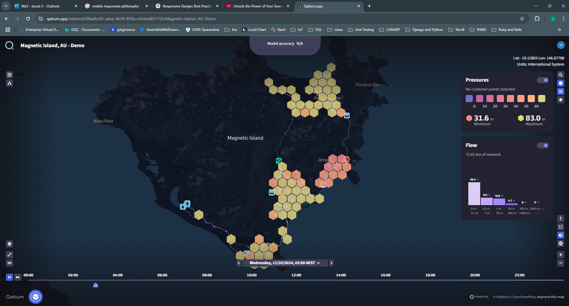
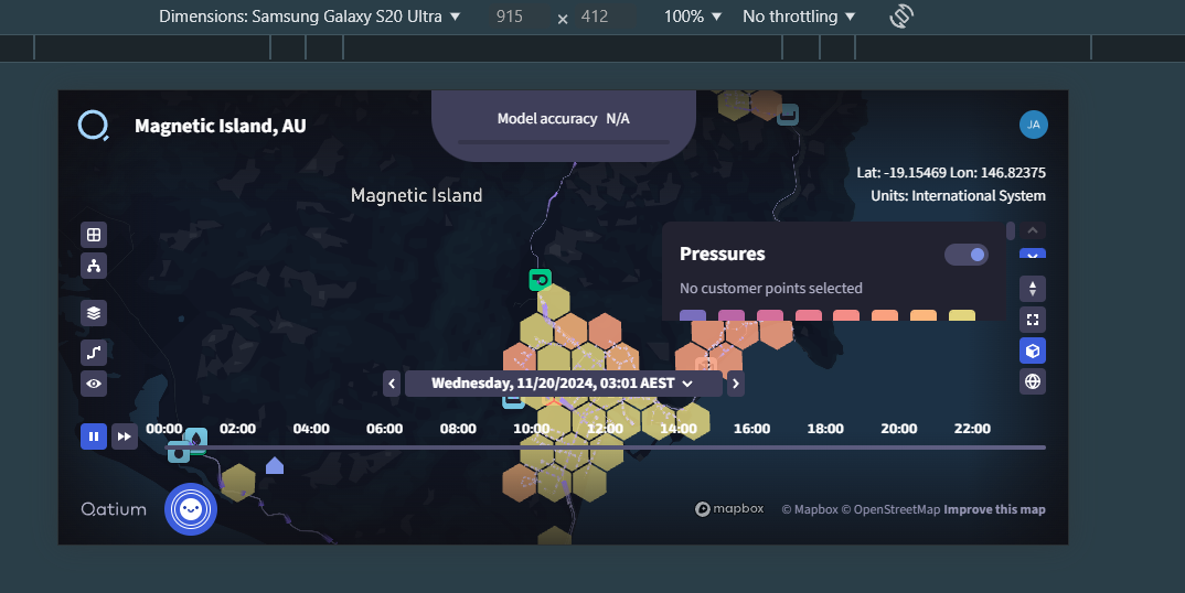
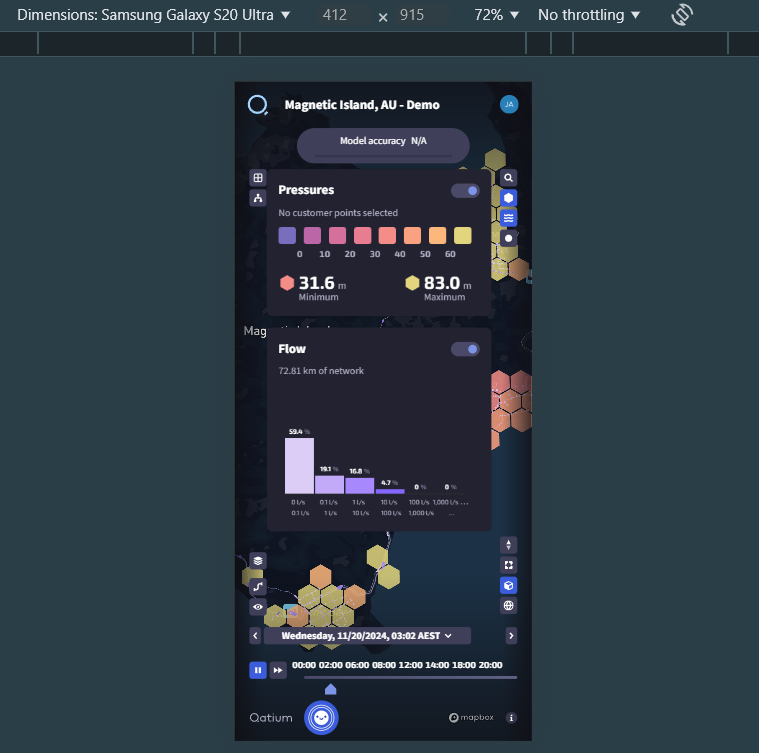
Qatium